


A single piece of signage can make your business shine—literally and figuratively—by maximizing visibility and brand impact. 3D illuminated signs are transformative tools that combine depth, lighting, and strategic design to capture attention day or night. For Australian businesses, these signs offer unparalleled advantages in competitive markets, from bustling city centers to coastal strips. This guide unpacks seven essential design principles to ensure your illuminated sign becomes a lasting asset, driving foot traffic and reinforcing brand identity without fading into obscurity.
Why 3D Illuminated Signs Matter
These signs transcend basic functionality, acting as silent ambassadors for your brand. By merging dimensional elements with integrated lighting, they create striking visual narratives that communicate professionalism and reliability before customers engage with your business. In Australia’s diverse commercial landscapes, they deliver consistent visibility: dimensional depth stands out in daylight, while illumination ensures prominence after dark. This 24/7 presence is invaluable for venues operating beyond standard hours, subtly signaling accessibility to passersby.
Beyond practicality, 3D illuminated signs foster memorability. Australian consumers gravitate toward distinctive branding, and a well-executed sign conveys investment in quality. Whether positioned in Sydney’s CBD or a relaxed suburban strip, it projects confidence and attention to detail. Customers instinctively associate this polish with the caliber of your offerings, turning signage into a trust-building asset.
Enhancing Brand Visibility
The dual impact of dimensionality and lighting ensures your sign remains effective in all conditions. Daylight highlights textures and shadows, adding tactile appeal, while evening illumination cuts through visual clutter. For businesses near high-traffic roads or evening entertainment hubs, this persistent visibility translates into passive customer acquisition. A glowing sign acts as a beacon, guiding potential clients to your doorstep without overt solicitation.
Standing Out in Australia’s Competitive Market
In crowded markets, differentiation is non-negotiable. A custom 3D illuminated sign leverages creativity to break through monotony. Australian audiences reward innovation—unique signage not only captures eyes but also embeds your brand in local consciousness. Moreover, it signals stability. A robust, professionally crafted sign suggests longevity, assuring customers your business is a fixture rather than a fleeting venture. This perception cultivates loyalty and distinguishes you from competitors relying on generic solutions.
Top 7 Design Tips for Effective 3D Illuminated Signs
Designing an exceptional sign requires balancing aesthetics, engineering, and environmental adaptability. These seven tips address common pitfalls while amplifying impact.
Tip 1: Select Quality Materials for Durability
Material choice dictates longevity, especially under Australia’s harsh climatic extremes. Opt for marine-grade aluminum or stainless steel frames, which resist corrosion from coastal salt air or inland humidity. Faces should use UV-stabilized acrylic or polycarbonate—these polymers withstand UV degradation without yellowing, maintaining translucency for decades. In regions like Darwin or Outback Queensland, where temperatures soar, thermoplastic composites prevent warping. Conversely, in alpine zones, frost-resistant seals prevent moisture ingress.
Durability also hinges on modularity. Design with replaceable components—such as interchangeable letters or serviceable light channels—to accommodate future rebranding. This foresight reduces costs and waste, extending your sign’s relevance. Partnering with fabricators who source certified materials ensures compliance with Australian standards, preventing premature failures.
Tip 2: Optimise Light Distribution
Uniform illumination avoids hotspots or shadows that obscure messaging. LEDs should be spaced precisely based on letter depth and viewing angles. For example, 12mm-deep letters require closer LED clusters than 50mm profiles. Backlit designs (halo effects) suit minimalist brands, emitting a soft glow from behind letters. Face-lit signs, where LEDs front-light characters, offer higher intensity for high-traffic zones.
Work with lighting engineers to calculate lumens needed for your location. A sign facing direct sunlight may require 50% brighter LEDs than one in a shaded laneway. Incorporating dimmers or photocells adjusts brightness autonomously, conserving energy while adapting to ambient conditions. Avoid over-illumination—excessive LEDs cause glare, reducing readability and annoying neighboring properties.
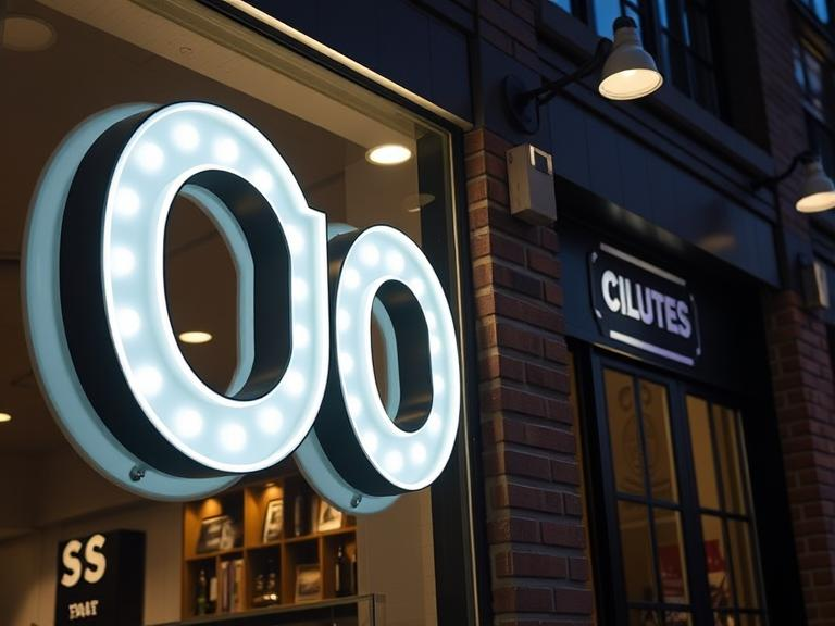
Tip 3: Use Colour Contrast Strategically
Colour psychology and contrast dictate readability and emotional resonance. Dark backgrounds (e.g., deep blue or black) with light lettering (white, gold) maximize legibility, while complementary palettes (e.g., teal on charcoal) inject sophistication. For brands tied to specific hues—like a café using earthy greens—maintain consistency but adjust saturation; illuminated colours appear 20% brighter when lit.
Consider contextual contrast. A red sign may vanish against brick facades but pop beside greenery. Nighttime introduces new variables: blue tones appear crisper after dark, while yellows cut through fog. Mock-ups in situ help test visibility across times and weather. Remember, colour influences perception—cool tones (blues, greens) suggest reliability, while warm tones (reds, oranges) evoke urgency. Align these subtleties with your brand ethos.
Tip 4: Pick the Right Illumination Technique
Your lighting method shapes brand personality. Edge-lit signs embed LEDs within letter borders, creating sleek, contemporary outlines ideal for tech or luxury brands. Front-lit designs bathe characters in direct light, ensuring maximum visibility for roadside venues. Backlit signs cast glows onto backdrops, offering subtlety for upscale restaurants or galleries. Hybrid approaches, like a backlit logo above front-lit text, provide hierarchical emphasis.
Factor in maintenance during selection. Edge-lit systems have fewer exposed components, simplifying repairs. For heritage buildings, softer backlighting preserves architectural integrity. Consult designers to match techniques with spatial constraints—e.g., shallow mounts suit compact urban storefronts, while larger installations leverage depth for dramatic effects.
Tip 5: Ensure Clear Fonts and Layouts
Legibility trumps stylistic flair. Sans-serif fonts (e.g., Helvetica, Gotham) enhance readability beyond 10 meters, while condensed scripts fail under illumination. Scale letters proportionally: 30cm-tall letters are visible from 30 meters. Limit copy to essentials—business name and core offering—avoiding cluttered taglines.
Layouts must guide the eye intuitively. Center-aligned text suits symmetrical facades, while left alignment aids drivers scanning quickly. Negative space is critical; padding around letters prevents a “busy” appearance. For multi-line layouts, prioritize vertical rhythm—consistent spacing between lines—to create cohesion. 3D elements should shadow uniformly, avoiding visual discord.
Tip 6: Plan for Installation and Maintenance
Placement determines visibility. Pedestrian-focused signs thrive at eye-level (1.5–2.5m), while vehicular signs need higher mounts (3–6m). Survey sight lines for obstructions like awnings or trees. Structural engineering is vital—cyclone-prone areas (e.g., North Queensland) require reinforced brackets, while seismic zones need flexible couplings.
Maintenance protocols prevent deterioration. Schedule bi-annual cleans using non-abrasive solutions to preserve finishes. LED drivers and transformers should undergo voltage checks annually. Choose suppliers offering service plans; modular designs allow single-letter repairs without full dismantling. Documenting maintenance not only extends lifespan but also ensures warranty compliance.
Tip 7: Comply with Local Regulations
Australian councils enforce strict signage codes. Melbourne mandates brightness limits post-11pm near residences, while Brisbane restricts projection sizes in heritage zones. Coastal councils (e.g., Gold Coast) demand corrosion-resistant materials. Energy-efficiency requirements also apply—Victoria’s Building Authority enforces wattage caps for illuminated signage.
Non-compliance risks fines or removal. Engage local sign specialists early; they navigate permit processes and engineer compliant solutions. For instance, dimming controls can meet curfew rules, and size limitations may inspire innovative vertical designs. Proactive adherence demonstrates community respect, bolstering brand reputation.
Common Mistakes to Avoid
Overlooking Lighting Efficiency
Inefficient LEDs inflate operational costs and shorten lifespans. Specify high-CRI (Colour Rendering Index) LEDs (≥90 CRI) for true colour fidelity. Avoid mismatched drivers—undervolting causes flicker, while overvolting burns out modules. Incorporate ambient light sensors to reduce output by 40% during daylight, slashing energy use without compromising impact.
Neglecting Weather Resistance
Australia’s climate demands rigorous material testing. In arid zones, UV-protective coatings prevent acrylic crazing. Tropical regions require IP67-rated seals against humidity. For alpine installations, heated LED housings prevent ice accumulation. Partnering with fabricators who test prototypes in environmental chambers mitigates weather-related failures.
Missing Opportunities for Energy Savings
Beyond LEDs, timers or motion sensors can deactivate signs during low-traffic hours. Solar integration is viable for sun-drenched sites—a 200W panel system powers most small-to-midsize signs. These upgrades reduce grid dependence and align with sustainability trends, appealing to eco-conscious consumers.
Frequently Asked Questions
Is LED the best option for illuminated signs?
LEDs dominate for efficiency, longevity (70,000+ hours), and design flexibility. They outperform neon in energy use (60% less power) and fluorescent tubes in cold-weather reliability. RGB LEDs also enable dynamic colour shifts for seasonal campaigns.
How can I make my sign more sustainable?
Use recyclable aluminum faces, solar-powered LEDs, and phosphate-coated steels to minimize environmental impact. Several Australian suppliers now offer carbon-neutral manufacturing, offsetting production emissions.
Should I hire a professional sign designer?
Absolutely. Experts balance aesthetics with structural integrity, navigate regulations, and optimize lifecycle costs. DIY attempts often overlook critical factors like load-bearing calculations or photometric planning, leading to safety hazards or premature failures.
Conclusion
3D illuminated signs are investments in brand elevation. By prioritizing durable materials, precise lighting, and regulatory compliance, your sign becomes a resilient, high-impact asset. Strategic colour and typography choices ensure instant recognition, while proactive maintenance safeguards your investment. In Australia’s competitive markets, these signs don’t just attract attention—they build enduring customer relationships through unwavering visibility and professionalism. Embrace these principles to create a signature piece that propels your business into the spotlight, day and night.


