


Color isn’t just decoration. It’s a language that communicates moods, shapes perceptions, and influences decisions—often without us realizing it. In presentation design, understanding and applying color psychology can be the difference between a message that resonates and one that falls flat. Let’s explore why color psychology matters so much in presentation design, how it shapes audience reactions, and what practical strategies you can use to make your slides truly impactful.
Why Color Matters in Presentations
Imagine you’re watching two presentations on the same topic. One uses carefully chosen colors to guide your attention, emphasize key points, and create a cohesive feel. The other throws together random colors that clash or feel dull. Which one do you remember? Which one feels more professional?
Color affects perception on both conscious and subconscious levels. It helps establish trust, communicates emotion, and creates visual hierarchy—making it easier for audiences to follow and absorb information. In a world flooded with content, color can be your secret advantage to stand out and stay memorable.
The Basics of Color Psychology
Before diving into specific applications, let’s cover a few fundamentals:
- Warm colors (reds, oranges, yellows): Energizing, attention-grabbing, evoke warmth or urgency.
- Cool colors (blues, greens, purples): Calming, professional, associated with trust, stability, and creativity.
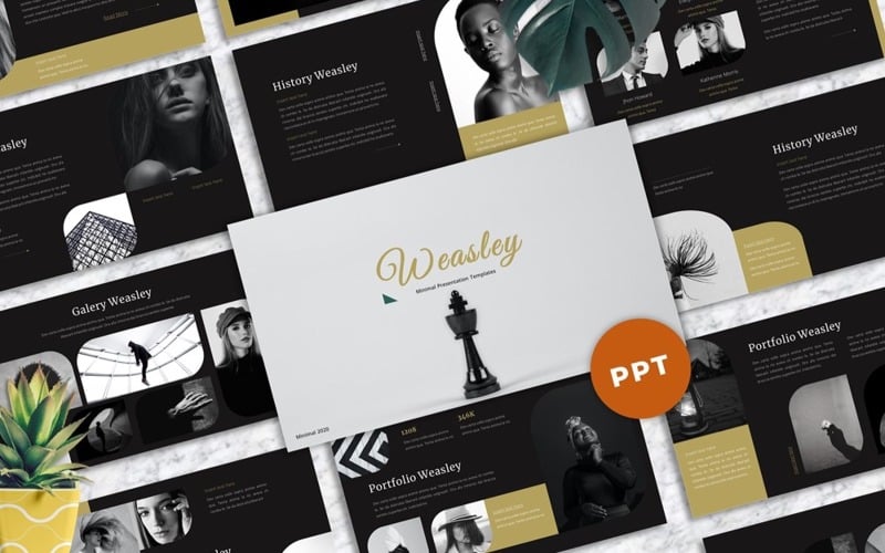
- Neutral colors (black, white, grays, browns): Provide balance, sophistication, and focus; often used as backgrounds or for text.
Cultural context also plays a role: for instance, while red can symbolize luck in some cultures, it might signal danger in others. So knowing your audience’s background is as important as understanding the color wheel.
Setting the Right Tone and Emotion
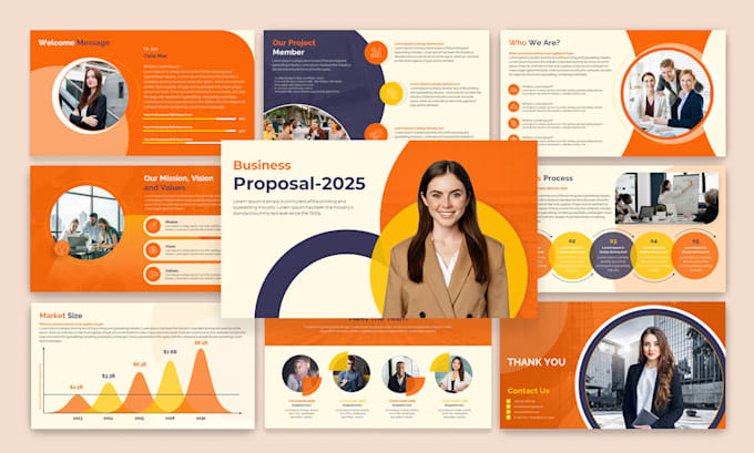
When designing a presentation, your color choices should align with the message and tone. Are you pitching an innovative product? Cool, vibrant blues with a splash of bright accent colors can communicate creativity and trust. Presenting annual financial data? Muted blues and grays can convey seriousness and professionalism.
Colors can also evoke emotional reactions:
- Red can stimulate excitement or urgency—great for calls to action, but use sparingly to avoid overwhelming.
- Blue is widely trusted, calming, and corporate-friendly—ideal for financial, healthcare, or tech presentations.
- Green suggests growth, sustainability, and health—perfect for environmental or wellness topics.
- Yellow is energetic and optimistic—effective for innovation and creativity, but too much can strain the eyes.
- Purple feels luxurious and creative—often used in design, fashion, and premium branding.
The goal isn’t to guess which color “looks nice,” but to choose colors that reinforce your message and resonate with your audience.
Guiding Attention with Color
Effective presentation design isn’t just about making slides look pretty; it’s about directing focus. Color helps you do that by creating contrast and hierarchy.
For example, using a bright accent color on your call-to-action text draws the eye immediately. Meanwhile, a subdued background keeps attention on the content instead of distracting the viewer. This method helps balance clarity and creativity.
Many professional designers and agencies use the 60-30-10 rule:
- 60%: Dominant color (background or main theme)
- 30%: Secondary color (supports the main color, used for shapes or secondary text)
- 10%: Accent color (highlights critical points or actions)
This balance keeps slides visually appealing and prevents color overload.
Enhancing Readability and Accessibility
It’s tempting to choose colors purely for aesthetics, but functionality matters just as much. Poor color choices can make slides hard to read or even inaccessible to part of your audience.
Key tips:
- Use high contrast between text and background.
- Avoid placing bright text on bright backgrounds.
- Consider color blindness: red-green color blindness is common, so don’t rely solely on color to convey meaning; use shapes, patterns, or labels alongside colors.
Professional presentation design agencies often test slides on multiple screens and lighting conditions to ensure consistent readability.
Building a Cohesive Brand Image
Color also plays a vital role in branding. When designing presentations, aligning your slide deck with your brand’s colors strengthens recognition and consistency.
Imagine a brand like Coca-Cola presenting slides without red accents—it wouldn’t feel right. Consistency builds trust and makes your content instantly recognizable. Many businesses work with a Presentation Design Agency to create custom templates that maintain brand integrity across different presentations.
If you’re designing on your own:
- Start with your brand’s primary colors.
- Add complementary secondary colors for variety.
- Use neutral tones for backgrounds to keep slides clean and uncluttered.
The Science of Warm vs. Cool Colors
Research supports the psychological effects of warm and cool colors. Warm colors can:
- Create a sense of urgency
- Boost energy levels
- Make spaces feel smaller and more intimate
Cool colors can:
- Reduce stress
- Encourage concentration
- Make spaces feel larger and more open
In presentations, this translates into different strategies. For motivational talks or sales pitches, warm accent colors can energize the audience. For data-heavy or training sessions, cooler tones can keep viewers calm and focused.
Real-World Examples
Consider TED Talks. Many slides from TED speakers use black or dark gray backgrounds with contrasting text and a limited color palette—this keeps the audience focused on the speaker and the message rather than flashy visuals.
Apple’s product launch presentations often use large, clean visuals with subtle background colors, emphasizing product photos and key messages. The minimalist use of color aligns with their brand and communicates elegance.
Practical Tips for Choosing Colors
- Start with your message: Define what you want the audience to feel—confident, excited, calm?
- Limit your palette: Too many colors look chaotic; three to four main colors is usually enough.
- Use tools: Websites like Adobe Color or Coolors help generate balanced color schemes.
- Test in grayscale: This checks whether your slides still work for people with color blindness or on less vibrant screens.
- Stay consistent: Keep the same colors for similar elements throughout the deck.
Avoiding Common Color Mistakes
Even well-meaning designers sometimes fall into these traps:
- Using trendy colors that don’t fit the topic or brand.
- Overusing bright accent colors, making the slides feel overwhelming.
- Relying only on color to convey meaning (like red = bad, green = good) without labels.
- Ignoring cultural nuances.
Being aware of these pitfalls helps you create designs that not only look good but also communicate effectively.
When to Seek Professional Help
If color psychology feels overwhelming, or if your presentation is critical to your business, consider working with a Presentation Design Agency. Professionals can align colors with your brand, message, and audience psychology, ensuring your presentation doesn’t just look appealing—it truly works.
The Bigger Picture: Color as Part of Storytelling
At its best, presentation design is storytelling—and color is part of the narrative. A slide deck shouldn’t just be a collection of pretty visuals; it should have a visual flow, guiding the audience emotionally and logically from start to finish.
A thoughtful color scheme:
- Introduces the tone in the opening slides.
- Reinforces key points in the middle.
- Leaves a memorable impression at the end.
When colors change subtly across a presentation (e.g., from cool blues at the start to warmer tones during the call to action), it can subtly guide the audience through your story arc.
Conclusion
Color psychology isn’t about picking your favorite colors or copying what you saw online. It’s about making intentional choices that support your message, connect with your audience, and create a cohesive visual experience.
Whether you’re designing slides yourself or working with a Presentation Design Agency, understanding the power of color helps you communicate more effectively, build trust, and leave a lasting impression.
By treating color as an essential storytelling tool rather than decoration, your presentations won’t just look beautiful—they’ll work beautifully, too.


